

Summercamp
Summercamp is a bold marketing agency based in Seattle. They’re growing—and their website needs to grow with them. While they are not a summer camp, they bring the campfire spirit to everything they do: curiosity, creativity, and a sense of fun. The goal was to create a clean, modern design with subtle animations and a tone that doesn’t take itself too seriously.
Role:
UX, UI, and Visual design.


Day and night mode.
I know, I know. It’s not the most original idea, but it aligns seamlessly with the summer camp theme, striking a balance between charm and sophistication.
The Summercamp brand was still in its early stages, and the clients were open to exploring image treatments, new typography, and the broader potential of their visual identity. With just a logo and four brand colors as initial guidelines, I had the opportunity to define and develop a cohesive visual language for them.
Exploring the Summercamp brand

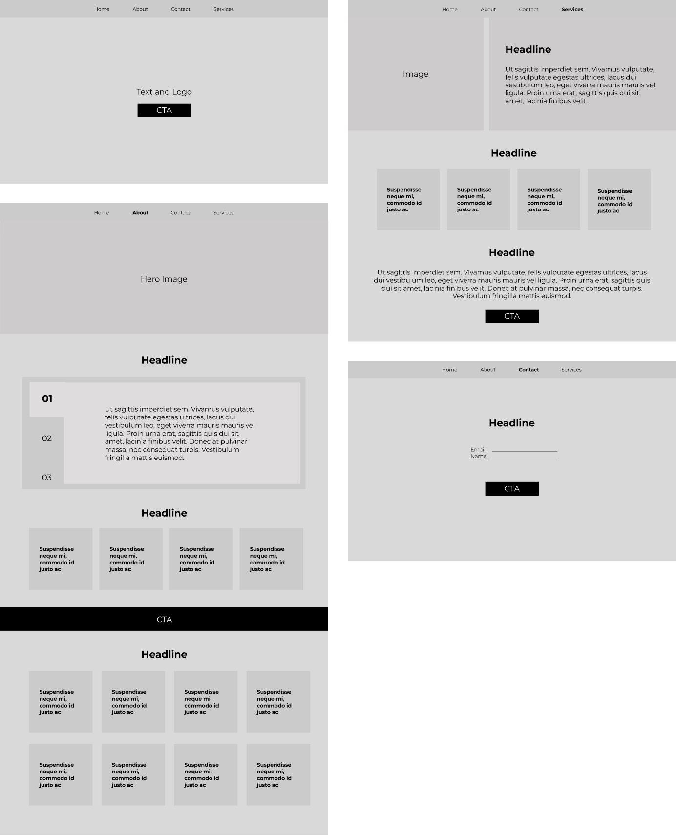
The client provided high-level wireframes as a starting point. From there, we discussed content, priorities, and how to create the greatest impact for users. Given the light content and the need for immediate engagement, I recommended a single-page scrolling layout as the most effective solution.
Wireframes
v1
v2
